
Herb Aesthetic
A Two-Part Brand U Lab Branding Series - Part One

Cannabis Iconography in Jamaican and Caribbean Music Graphics
Roots, Ritual, and Resistance: How Cannabis Imagery Became Reggae’s Visual Language
So, who really owns Reggae’s visual language? From sacrament to protest to nightlife code, cannabis imagery in Reggae and Caribbean album covers, and posters has long worked like a brand mark, defined by palette, typography, and cultural details.
As the herb aesthetic gets remixed, sold, and spun in every corner of the globe, it is time to ask: who is pocketing the profits, and who is left watching from the sidelines?
Before we dive into colour codes and design methods, hit pause for a second.
What actually happens when a grassroots symbol turns into a global shortcut?
In Part 1, we break down the visual vocabulary and examine the album covers which established and continue to complicate these questions.
Some visuals instantly say Reggae before the music even starts: red, gold, and green, hand-painted lettering, a lion, a haze of smoke, and often the cannabis leaf. But these colours and icons are more than just decoration. They connect to deep roots in colonial and post-colonial history. The red-gold-green palette, for example, comes from the Ethiopian flag and Pan-African movements, symbolising pride, unity, and resistance for generations shaped by Caribbean colonialism.
As a Nyabinghi elder once put it: These colours, and the herb itself, carry the memories of struggle and the prayers of our people. Every time I see the leaf, I remember the elders who used it as a bridge to the Most High and a shield against Babylon’s laws.
But the herb aesthetic is more than just a symbol for stoners. In Jamaican roots culture, it can stand for spirituality, as in Rastafari’s use of the cannabis herb as a sacrament; for politics, such as criminalisation and resistance; for community, such as sound-system dance culture; and for commerce, including export markets, tourist imagery, and, later, global cannabis branding.
This two-part series unpacks how cannabis imagery shows up across Jamaican, Reggae, and Caribbean-adjacent cover art and poster culture, and how you can read it with a designer’s eye.
By the end of Part 1, you will spot the key visual cues and decode the design language behind classic album covers (no art degree required).
In Part 2, you will see how these visuals evolve in posters, flyers, and other genres, and pick up practical tools for crafting your own authentic herb-inspired designs. You’ll walk away with a sharper eye, a hands-on toolkit, and the confidence to put these lessons to work in your next creative or brand project.
What “Cannabis Imagery” Looks Like in Reggae Graphics:
A Visual Glossary
Cannabis shows up as an object, a symbol, or even a design texture. As you read, let your imagination off the leash, picture every detail, and bring all your senses to the party, not just your eyes.
Leaf icon (single leaf, repeating pattern, or “logo leaf”): Picture the jagged outline, bright on an album cover. Imagine how it would feel when you touch its dry, papery surface.
Spliff, chalice, or pipe (ritual and lifestyle cues): Imagine the earthy smell from a slow-burning spliff or the weight of a carved chalice being passed from person to person.
Smoke as composition (swirls, gradients, airbrush haze, “dub fog”): Picture curls of smoke along the edges of a cover, their softness showing movement. Remember the sweet, dense smell that lingers after the music ends.
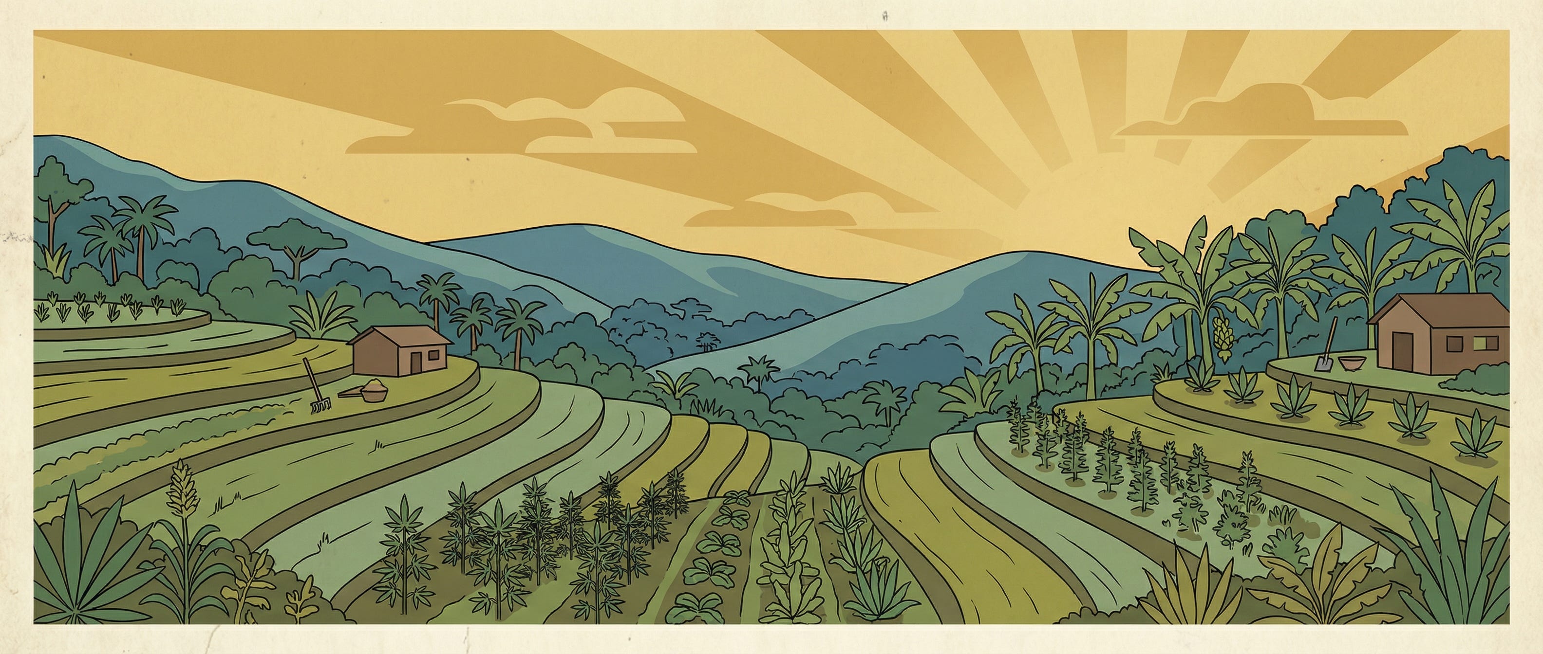
Agrarian cues (fields, hills, ital or nature palette): Picture dew on wide green leaves, rich Jamaican soil under bare feet, and the taste of fresh-cut herbs in the morning.
Rasta symbols layered in: lion, Ethiopian colours, dread imagery, Psalms or Biblical cues, ital foods. See the golden shine of a lion’s mane, hear the beat of ancestral drums, feel the rough thread of a hand-dyed flag, or the deep sound of sung scripture.
Coded typography: sign-painting, hand-lettering, militant stencils, condensed caps. Imagine the feel of brushstrokes, or the sound of a marker squeaking on poster board. Notice the urgency in each bold letter.
Print artefacts: halftone dots, photocopy grit, misregistration, especially on flyers. Imagine running your thumb over the rough Xerox ink, feeling the uneven layers where colours missed their mark, or remembering the smell of fresh toner in a local print shop.
Why Reggae’s Herb Visuals Land Differently Than Rock or Hip-Hop
If rock shouts and reggae chants, their visuals sing the same tune. In rock or hip-hop, weed imagery jumps out, neon flashes, cartoon smoke, pure rebellion. Reggae visuals, though, move like a call-and-response: icons and colours repeat in a ritual rhythm, signalling sacrament, community, and identity. That shift rewrites the whole design language:
Recreation: wink-and-nod humour, candy colour, caricature, product parody
Sacrament: nature reverence, ritual objects—chalice, calmer earth tones
Politics: placard-like slogans, militant type, documentary portraiture
Jamaican music design grew up in small studios and local print shops, think hand lettering, fast turnarounds, and a street-level graphic directness. Less agency polish, more real-world authority.
Picture this: a print shop in Kingston at dusk. Stacks of colored paper crowd the counter, last-minute instructions fly over the clatter of an old offset press, and a hand-lettered flyer hangs to dry, ink still tacky. That rush and resourcefulness shaped the style: direct, bold, and built for the street.
Three Core Herb Aesthetics in Jamaican and Caribbean Music Graphics
Think of these as the Policy, Pastoral, and Party archetypes. This is a framework you can remember easily.
Policy The Activist Cover: Herb as Policy - Documentary photo, bold headline type, green as emphasis, minimal metaphor.
Pastoral The Sacramental and Nature Cover - Herb as Ital. Botanical cues, earthy greens and golds, softer type, pastoral or reverent composition.
Party The Dancehall Flyer. Herb as Nightlife Code - Photocopy, grit, clip-art leaves, neon stock paper, stacked type, controlled chaos.

Album Covers and Artwork: Design Breakdowns
Peter Tosh, Legalize It (1976)
Where to find it: Album Art Exchange | Discogs
Caption: Peter Tosh, Legalize It album cover. A cornerstone activist archetype: the portrait is the argument, the spliff is the logo object, and the title reads like a demand.
This is the activist cover at peak clarity: the image is evidence, the title is a policy statement.
Design elements to notice:
Colour: natural greens and browns, and skin tones, real-world palette = credibility
Symbolism: the spliff is both object and argument
Typography: direct, headline-like
Composition: portrait dominance; prop becomes a brand mark
Brand lesson: When the message is political, reduce cleverness and increase clarity.
Black Uhuru, Sinsemilla (1980)
Where to find it: Album Art Exchange | Discogs
Caption: Black Uhuru, Sinsemilla album cover. Green-forward semiotics: even without a literal leaf, the title primes the viewer to read colour and mood as meaning.
If the name includes the symbol, the artwork can focus on atmosphere and identity rather than on a literal depiction.
Design elements to notice:
Colour: green as thematic anchor; warm accents add heat/urgency
Typography: bold, legible, “international” rather than pastoral
Imagery: often iconic and mystic vs comedic varies by pressing
Brand lesson: Naming can do symbolic work, freeing the visual to build mood.
Eek-A-Mouse, Ganja Smuggling
Where to find it: Discogs | Soul Jazz Records
Caption: Eek-A-Mouse, Ganja Smuggling single sleeve / art variation.
Weed as storyline: contraband cues and humour create a caper tone instead of a sermon. But where is the line between playful narrative and stereotype? When humour drives the concept, designers face a decision: Are they amplifying cultural voice, or sliding into caricature? Inviting the audience to notice this tension can help keep the visual choices smart, respectful, and rooted in context.
Here is a quick gut check: Does the joke land because it is shared, or does it flatten the culture for outsiders? Would someone from the community see themselves in the design, or see a punchline? This test keeps the humour lively and the respect intact.
Here, the herb is a narrative device, smuggling, movement, and mischief telegraphed through props and playful layout.
Design elements to notice:
Colour: brighter greens, high-contrast accents
Symbolism: weed plus transport/contraband cues = instant plot
Typography: playful, exaggerated, cartoon-adjacent
Imagery: an illustration or a staged photo that reads fast on a rack
Brand lesson: Humour is positioning. One wink can reframe the whole brand voice.
Pass the Kouchie Visuals (Chalice/Kouchie Motifs)
Where to find it: Discogs: Mighty Diamonds, Pass the Kouchie | ReggaeRecord.com feature
Caption: Pass the Kouchie era visuals sleeves and labels. The chalice/kouchie is a culture-specific icon that signals ritual and community beyond the generic leaf.
The chalice differentiates sacrament-coded visuals from generic recreational symbols.
Design elements to notice:
Symbolism: chalice = ritual and community
Colour: earth tones with Rasta tri-colour accents
Typography: roots hand-lettering or dancehall block caps (context shifts meaning)
Brand lesson: Specific cultural objects beat generic icons: more authenticity, more distinction.
Ganja-Themed Reggae Compilations
Where to find it: Discogs: Greensleeves Ganja Anthems | Spotify: Trojan Ganja Reggae Box Set
Caption: Ganja-themed reggae compilations (Trojan / VP / Greensleeves-era examples). Leaf collage plus red, gold and green becomes retail shorthand, effective if often blunt.
Compilation design reveals what the market recognised instantly: colourway plus leaf = category.
Design elements to notice:
Colour: saturated Rasta tri-colour; green dominates
Typography: big, retail-friendly, often outlined/bevelled
Imagery: repeated leaf silhouettes, smoke overlays, photomontage
Brand lesson: Obvious can win in crowded contexts, if hierarchy and restraint keep it from becoming noise.
White Labels and DIY Leaf Marks
Where to find it: Search Reggae White Label Dubplate stamp on Google or on Discogs Reggae Dubplate archives. These are best sourced from sound-system culture photography collections and reissue liner notes.
Caption: Dubplate / white-label close-up with leaf stamp or hand mark. The purest branding: a repeatable symbol applied quickly, where the culture lives.
Sometimes, a single stamp beats the slickest logo, especially when it is part of the scene. Picture a Kingston dance: the crowd buzzing as the soundman unpacks a stack of white-label dubplates. I once watched someone ink a rough green leaf straight onto a fresh sleeve, right beside a roadside food stall.
People leaned in and recognised it instantly, not just as a reggae symbol, but as proof the record was rare, local, maybe even one-of-a-kind. That quick, rough-edged leaf mark became a badge of authenticity, in a world where scarcity and speed matter, a simple DIY stamp can turn a plain record into a treasure, its meaning made real by culture and ritual.
Design elements to notice:
Colour: one ink (green or black)
Typography: minimal; the mark identifies
Texture: imperfect edges = authenticity and scarcity cues
Brand lesson: A low-cost, repeatable mark can be the strongest identity system.
Brand U Lab Takeaways
The album cover is where cannabis iconography in Reggae does its heaviest lifting. Whether the herb shows up as a political prop, Peter Tosh, a naming strategy, Black Uhuru, a ritual object (the chalice or kouchie), Eek-A-Mouse, a narrative device, a retail pattern compilation, or a DIY stamp on white labels, the design logic stays the same: palette, typography, and cultural specificity shape the meaning.
Break down a great cover, and you will see brand strategy in action, palette, type, and context working together to stand out and connect. Each visual approach builds relevance by reflecting the audience’s values and identity, while the right mix of elements helps the artist or release pop in a crowded field. Treat these visuals as levers for brand positioning, and you will sharpen both authenticity and impact, turning the cover into more than art, a true competitive edge.
Pause and play along: Ready for a design sprint? Set a timer for 60 seconds and imagine you are racing to create a streaming playlist thumbnail.
What would you pick to shout activism, or to whisper nightlife? Which visual cues would you dial up: palette, icon, type, or context?
For a creative jolt, sketch two quick thumbnails, one for each vibe, giving yourself just a minute per sketch. Let the time crunch push you from theory to action. Think about the feeling you want to spark, and how these traditions can guide your choices.
Next up in Part 2: We move from album covers to posters, flyers, and cross-genre pollination, then close with the full design toolkit and Brand U Lab takeaways for avoiding clichés while honouring the tradition.
Sources: Discogs label scans, Album Art Exchange, Soul Jazz Records reissues, ReggaeRecord.com, and Jamaican sound-system flyer archives, The People’s Graphic Design Archive, WePresent.

Let Us Build Together
Need a brand audit or retail floor plan refresh? Looking for guidance on culturally grounded, regulation-aligned cannabis retail?
Book a 20-minute Brand U Lab Check-In.
Subscribe for people-and-culture-first and cannabis-branding insights.
Contact us for design packages that move community, product and people.
Brand U Lab
Vision. Values. Voice. | Brooklyn-rooted. Culture-forward. People-to-people.
hello@brandulab.com | brandulab.substack.com | Brand U Lab
Don’t forget to: like | restack | comment | subscribe | share everywhere